
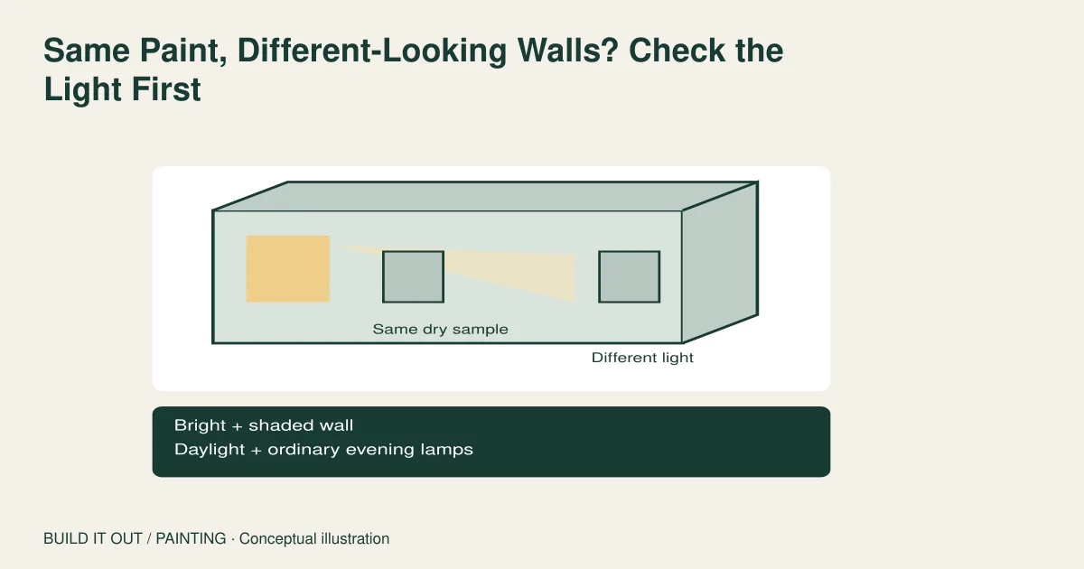
The paint may be the same while the light reaching each wall is different. Before repainting one “wrong” wall, compare a dry movable sample in the bright and shaded parts of the room, during ordinary daytime and evening use. Keep the paint product and finish fixed while you compare. This separates a lighting preference from a possible coating mismatch without promising a diagnosis.
The gray looked balanced on the sample. After the room is painted, one wall looks blue and the next looks warm. Changing that one wall to another shade seems obvious—but it can create a real mismatch when the daylight changes. Sherwin-Williams explains that light direction, light source and paint finish all affect perceived color. The useful decision is whether the coating differs, the viewing conditions differ, or both.
A whole-room effect is different from a touch-up patch
This article concerns broad differences between walls or between daytime and nighttime. A small rectangular patch, repeated roller stripe or repaired hole has a different investigation: application texture, coverage and sheen may be involved. Record the pattern first. If an entire wall shifts in appearance with the room’s light, color selection deserves attention. If the difference follows a narrow application boundary, ask the painter to inspect the finish before buying another shade.
Window direction is useful context, not a complete prescription. Benjamin Moore organizes color guidance by room orientation, but neighboring buildings, trees, window coverings and the times a room is used can change the light actually present. A room label cannot substitute for looking at the room.
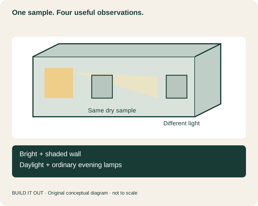
Our four-position comparison: move one sample, change one thing
This is an editorial worksheet, not a color-measurement test. Use a sample prepared according to its maker’s instructions, allow it to dry, and identify its product and finish. Dunn-Edwards’ color-selection brochure, page 4, recommends examining samples on differently lit walls and at different times. Our addition is a fixed route and a record of what changed.
| Position | Keep fixed | Record |
|---|---|---|
| Bright wall, daytime | Same sample and viewing height | Does it feel too light, warm, cool or saturated? |
| Shaded wall, daytime | Same sample; avoid comparing a different paint | Does the concern follow the location? |
| Bright-wall location, evening | Same room lamps normally used | What changes when daylight is absent? |
| Shaded-wall location, evening | Same sample and ordinary viewing distance | Is the difference still acceptable for this room’s use? |
For each entry, write “acceptable,” “uncertain” or the specific concern. Avoid giving the colors invented numerical scores. Then decide which observation matters most: a breakfast room mainly used in morning daylight has a different priority from a living room used after sunset. That is a preference decision, not evidence that one light source shows the single correct color.
Check the lamps before ordering different paint
Daylight and electric light need separate observations. Farrow & Ball describes how warmer and cooler artificial light can change a wall’s cast. Crown likewise recommends sampling under different lighting. Evaluate the lamps the room will actually use; replacing every bulb merely to rescue an unsuitable paint is a separate design choice.
If the room contains adjustable lamps, compare the settings already available and note them. Do not alter wiring or fixtures for this exercise. When one lamp is changed during the comparison, record that change rather than attributing the whole difference to the wall. A sample compared under morning daylight and then a different bulb at night has changed more than one condition.
The floor and furniture belong in the comparison
A sample against bare white paper is not the same visual scene as a wall above a dark floor and beside colorful curtains. Asian Paints includes flooring, furnishings and soft finishes in its sampling advice. Keep the major permanent materials nearby when evaluating color. You do not need a completely furnished room, but hiding the dominant floor color can conceal a relevant interaction.
Resene’s color guide describes both nearby-color effects and changes in light or gloss. We use those general principles here; its New Zealand orientation advice is not transplanted into a US north/south rule. If a candidate works only with an item you intend to replace, put that assumption in the room plan before ordering.
Check what the sample actually represents
A color sample is valuable, but its finish may not be the finish selected for the walls. Little Greene identifies the flat finish used in its sample pots and recommends movable painted cards. Ask the retailer how to assess the chosen final product and sheen if appearance is critical. A flat sample does not demonstrate exactly how a more reflective wall coating will look.
Phone photos and digital visualizers help record ideas, but they do not settle a paint dispute. Tikkurila explicitly warns that electronically generated color representations may differ from actual paint. Use pictures as location records. Preserve the real product labels and examine physical samples when deciding.
When a color comparison needs another kind of assessment
Color professionals control viewing conditions for a reason. Konica Minolta’s specialist visual-evaluation guidance distinguishes changes in lighting and viewing angle from a controlled comparison. It also defines metamerism as a relationship between two samples that match under one light but differ under another. One wall looking different at night does not, by itself, establish that diagnosis.
- The same sample changes as it moves: lighting and surroundings are relevant; decide whether that range is acceptable.
- The sample and a painted wall disagree consistently: verify product, finish, coat history and the sample’s purpose with the retailer or painter.
- Only stripes, edges or isolated patches disagree: request a finish assessment before treating it as a room-wide color problem.
- The room works in some conditions but not those used most: revise the color or lighting plan as a deliberate choice, then test again.
Keep the four-position notes with the final product record. They explain why a color was selected—and make a later conversation more useful than comparing two differently exposed phone photographs.
Sources and method
Prepared by Build It Out from the primary and specialist resources below; checked October 25, 2026. The decision aid and artwork are editorial synthesis, not a field test or professional inspection. Product examples retain their own scope; follow the current instructions for the exact US product being used.
- Sherwin-Williams: How Light & Finish Affect Paint Color
- Dunn-Edwards: How to Choose Color
- Resene: The 8-step colour scheme
- Farrow & Ball: How Light Affects Colour
- Crown Paints: Lighting
- Little Greene: Using Sample Pots
- Benjamin Moore: Selecting Color By Direction
- Asian Paints: How to Test a Paint Colour Before You Buy
- Tikkurila: Light grey color specification and display disclaimer
- Konica Minolta Sensing: Best Practices for Visually Evaluating the Color of Samples